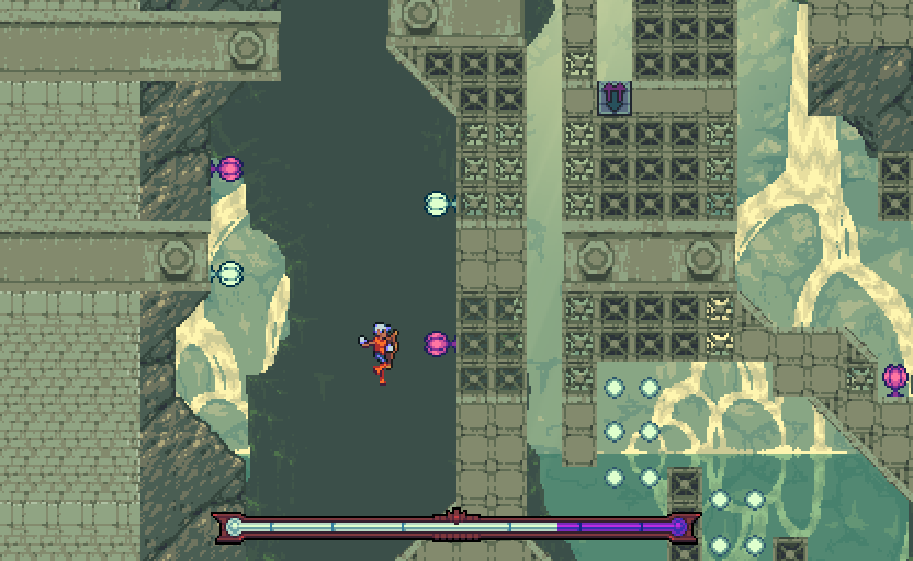
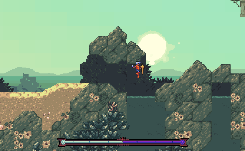
Thanks to my pixel art blog, a lot of games have shown up on my radar that I know little to nothing about. That is, nothing other than the fact that they look gorgeous. On the top of that list is Even the Ocean, a platformer by the people behind Anodyne. I recently played Motion Demo #1, and while it's still in a very early stage of development, it's lovely to see the art in motion - and to get an idea of how the mechanics actually work. What strikes me as interesting is the fact that Even the Ocean is actually two games in one - "The Ocean" and "Even" respectively - but more on that later. This demo showcases "The Ocean", the more gameplay-heavy of the two.

The main mechanic of "The Ocean" is an energy bar that acts as both health and a movement modifier. If the bar is mostly one color, running speed is slowed while jumping is increased. If it is the other, your run becomes a sprint and your jumps become much shallower. On top of this, if the energy bar fills up to either side, you die. This creates an interesting situation where everything is simultaneously a powerup and a death trap. If you choose to favor one side heavily over the other, you risk half of the level killing you with one wrong move. I can see this being used strategically when it comes to speedruns - matter of fact, the demo has a specific settings menu dedicated to speedruns. There's already a section of the demo that encourages you to beat the developer's best time, and it's pretty obvious that there are white and purple orbs placed in a way that can either help or hurt how quickly the player could get through a specific section. However, from the short time I spent with the game I couldn't really see a huge advantage in using one ability or the other. Considering this is an early demo that doesn't bother me terribly, but it leaves me rather curious as to where the mechanics are going in the future.

The demo was also pretty sparse of the beautiful art shown here, save for one or two areas. This was on purpose, though, as it looks like a good chunk of this game will be dedicated to exploration - something that shouldn't be spoiled yet. Still, the few completed areas that were shown really show the potential of this game. The calming color palette looks lovely fully animated. When combined with the ambient music and sound design I loved so much in Anodyne, it creates an environment perfect for getting lost in (matter of fact, you should really scroll down and play the music before you finish reading this). Even in places where I was dying constantly trying to figure out the design of a level, I was never frustrated. It didn't really feel like I was going anywhere specific - once again something that will change in the final release - but exploring around is still a pleasure. I know this game is going to be story heavy, and if this game is going to be anything like Anodyne, I'm excited to get lost in its world upon final release.
Motion Demo #1 is actually free to download here with the option to pay what you want. It's really not a whole lot, but consider it a donation to help the development process move along. Coming from the people that were brave enough to their game on the front page of The Pirate Bay and often have really interesting thoughts about game design, I'd say these guys are genuine enough to deserve your money.
Co-Founder, Webmaster
Glitch artist, game boy camera enthusiast, software engineer, tattooed nerd. Used to write words for this site, now mostly writes code.
Glitch artist, game boy camera enthusiast, software engineer, tattooed nerd. Used to write words for this site, now mostly writes code.